We know how the number of sunspots has varied since before the industrial revolution. Satellites have measured the total solar irradiance at the top of the atmosphere since the late 1970s. There is a strong positive correlation between the number of sunspots and the solar irradiance. The number of sunspots is therefore a good proxy when estimating the solar irradiance before the satellite era.
NOAA summarizes the connection between solar irradiance and global temperature on their web site: 'If the Sun were to intensify its energy output then, yes, it would warm our world. Indeed, sunspot data indicate there was a small increase in the amount of incoming sunlight between the late 1800s and the mid-1900s that experts estimate contributed to at most up to 0.1°C of the 1.0°C (1.8°F) of warming observed since the pre-industrial era. However, there has been no significant net change in the Sun’s energy output from the late 1970s to the present, which is when we have observed the most rapid global warming.'
The three figures in this blog post are based on monthly values that are updated up to and including December 2020.
Solar intensity and sunspots
The solar intensity varies by approximately 0.1 per cent over a solar cycle. Both the variations and the average value of the intensity differ a little from one cycle to the next. A solar cycle lasts on average for just over 11 years.
Figure 1 shows the solar irradiance and the number of sunspots since the mid-1880s. It covers a little more than 12 solar cycles. Appendixes A.1 and A.2 explain from where the Total Solar Radiance and the Sunspot numbers are downloaded.
 |
| Figure 1: The blue curve shows how the solar intensity has varied since the mid-1880s. It refers to the blue values on the left y-axis, which is the Total Solar Irradiation in Watts per square meter. The red curve shows the number of sunspots. The curves are based on monthly values that are smoothed by calculating the average over 36 months. |
Solar intensity and Global temperature
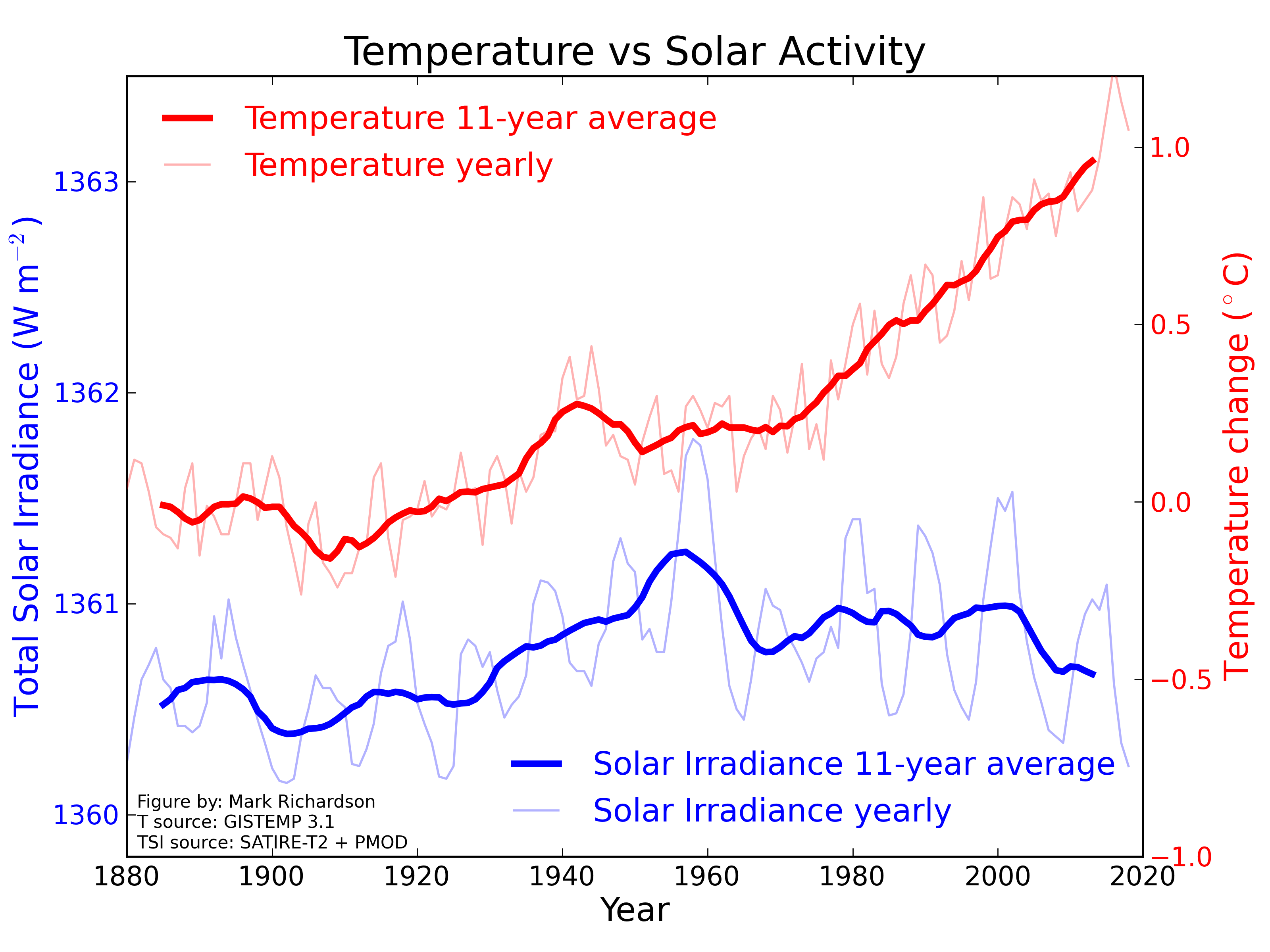
Figure 2 shows the solar irradiance and the global temperature since the mid-1880s. The global temperature is the average of four temperature series with global coverage. Appendix A.3 explains from where they are downloaded.
 |
| Figure 2: The blue curve shows how the solar intensity has varied since the mid-1880s. It refers to the blue values on the left y-axis, which is the Total Solar Irradiation in Watts per square meter. The red curve shows the global temperature relative to the reference period January 1880 till December 1899. The temperature has risen almost 1.2 degrees Celsius since then. The curves are based on monthly values that are smoothed by calculating the average over 36 months. |
The just mentioned NOAA website also claims that 'A second reason that scientists have ruled out a significant role for the Sun in global warming is that if the Sun’s energy output had intensified, we would expect all layers of Earth’s atmosphere to have warmed. But we don’t see that. Rather, satellites and observations from weather balloons show warming in the lower atmosphere (troposphere) and cooling in the upper atmosphere (stratosphere) — which is exactly what we would expect to see as a result of increasing greenhouse gases trapping heat in the lower atmosphere.'
Update: On February 25, 2021, I swapped the red and blue colors in Figure 1 and 2. I also changed the vertical scaling. I made these changes to be more compatible with two NASA figures (see here and here) used on many websites.
Appendix A Data sources
A.1 Total Solar Irradiance TSI
The Total Solar Irradiance, TSI, is the power in Watts [W] of the radiant energy emitted by the Sun that falls on one square meter [m^2] outside the earth's atmosphere. The square meter is perpendicular to the sun rays. TSI is compensated for the elliptical orbit of the Earth around the Sun.
The solar irradiance values were downloaded from the web interface LISIRD, which is run by The University of Colorado at Boulder’s Laboratory for Atmospheric and Space Physics (LASP). LISIRD is an abbreviation for LASP Interactive Solar Irradiance Data Center. The 'NRLTSI2 Monthly Averages' are used for the timespan from 1882 till 2019, the limits included.
The 'TSIS Total Solar Irradiance - Daily Average' values were used for the 12 months in 2020. The monthly values were calculated as a weighted averages of the daily values. The NRLTSI and the TSIS values overlap in 2018 and 2019. In these months, the TSIS values are on average 0.8824 W/m^2 higher than the NRLTSI values. The standard deviation of the differences is small, only 0.0286 W/m^2. To make the two series compatible, 0.8824 W/m^2 is subtracted from the TSIS monthly values.
The NTRLTSI values are calculated by a model. It uses proxy values, such as sunspot numbers, and satellite measurements when they are available. They are produced by NOAA as a Climate Data Record.
A.2 Sunspots
The monthly sunspot numbers, updated up to and including December 2020, were downloaded from SILSO in the end of January 2021. SILSO presents itself as the 'World Data Center for the production, preservation and dissemination of the international sunspot number.'
A.3 Global temperature
The temperatures in Figure 2 are the average of four temperature series with global coverage. They are NASA GISTEMP, NOAA Global, Berkeley BEST and HadCRUT4 kriging. They were downloaded in the end of January 2021, and they contain temperatures up to and including December 2020.
The industrial revolution took place between 1760 and 1840. Temperature measurements with nearly global coverage first began between 1850 and 1880. Pre-industrial temperature is thus undefined and open for scientific discussions.
Both NASA and NOAA define the average temperature in the reference period January 1880 till December 1899 as the pre-industrial temperature. Zeke Hausfather at CarbonBrief accepts this. IPCC defines the average temperature in the 51 years between January 1850 and December 1900 as the pre-industrial temperature. The NASA GISTEMP and the NOAA Global temperature series start in January 1880, and the Berkeley BEST and the HadCRUT4Kriging series start in January 1850.
For the Berkeley BEST series, the average temperature in the reference period January 1850 till December 1900 is 0.011°C warmer than it is in the reference period January 1880 till December 1899. For the HadCRUT4Kriging temperatures it is 0.019°C warmer. These differences are small, much less than the uncertainties in the temperature measurements before 1900. Therefore it matters little which of the two reference periods we use when calculating the temperature rise since pre-industrial time. I choose to use the reference period January 1880 till December 1899, mainly because it can be used for all the four series. With this definition, Figure 2 shows the temperature rise since pre-industrial times.
The four temperature series are calculated by different teams at different sites. Despite this, their results are quite similar. Figure 3 shows the differences between each of them and their average when the temperatures are relative to the reference period January 1991 till December 2020. The differences in the figure are smoothed by averaging them over 36 months.
 |
| Figure 3: Difference between the four global temperature series and their average when they are relative to the reference period January 1991 till December 2020 |
The root mean squares (rms) of the differences shown in Figure 3 are about 0.03°C for each of the temperature series.
January 1991 till December 2020 is the reference period that will be used by WMO and the Norwegian Meteorological Institute. In addition, I assume that it is the 30 years period with the most reliable temperature measurements. This is the reason for choosing that reference period when calculating the differences in Figure 3. If I had applied the pre-historical reference period from January 1880 till December 1899, the rms values of the differences would have increase by about 50 percent. The differences are small, also with that shorter reference period. I therefore believe that the average of the four temperature series with global coverage gives the best estimate of the global temperature.
Ingen kommentarer:
Legg inn en kommentar