Global surface temperature is the temperature at the land and ocean surface. Several organizations and universities provide global surface temperature series. They start in 1880 or earlier.
Radiosonde temperatures are measured by weather balloons when they rise in the atmosphere. Global radiosonde temperatures are available since 1958. NOAA publishes the RATPAC-A and the RATPAC-B series of radiosonde temperatures. The series differ somewhat due to different post processing. NOAA claims that RATPAC-A is the most robust one and they recommend to use that series when evaluating long term climate trends.
Satellite temperatures are calculated on the basis of microwave measurement done by satellites. They are calculated for several altitudes in the atmosphere. They are available since 1979.
The organizations and universities apply different algorithms and they use different selection of raw measurements when calculating their series of global surface temperature. Yet they calculate approximately the same rise in the temperature for the last forty years. On the other hand there is a relatively large gap between the series of radiosonde and satellite temperatures. I therefore consider the series of the global surface temperature as the most robust ones.
The figures in this blog post show global temperature at the Earth's surface, in the lower troposphere and in the lower stratosphere. The legend text in the figures abbreviates Temperature in the lower troposphere as TLT and Temperature in the lower stratosphere as TLS. The troposphere is the lowest atmospheric layer and it is about 10 km thick. The stratosphere is the atmospheric layer from about 10 to 50 kilometers above the Earth’s surface.
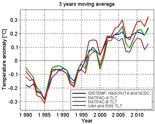
In Figure 1, the temperature at the Earth's surface is plotted with the blue line labeled GISTEMP, HadCRUT4 and NCDC. The radiosonde (balloon) temperature in the lower troposphere is plotted with the red line labeled RATPAC-A TLT, and with the green line labeled RATPAC-B TLT. The satellite temperature in the lower troposphere is plotted with the brown line labeled UAH and RSS TLT.
Figure 1 shows three years moving averages of the global surface temperature and of the temperature in the lower troposphere. The first temperatures in the figure are plotted in 1980. They are the average of the temperatures in 1979, 1980 and 1981. All figures in the blog post show three years moving averages.
Figure 1 shows that the temperature at the Earth's surface and in the lower troposphere has increased. The surface temperature has increased less in the last decade than it did in the previous decades, and the satellite temperature has not increased at all in the last decade. The radiosonde temperature RATPAC-A, which NOAA recommends to use when evaluating long term climate trends, has increased rather steadily also in the last decade. The radiosonde temperature RATPAC-B agrees well with the surface temperature.
The figures in this blog post show temperature anomalies relative to the reference period 1981 to 2010. A temperature anomaly is the difference between the real temperature and the average in the reference period. The radiosonde and satellite temperatures are anomalies relative to the average in the specified altitudes.
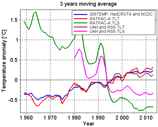
Figure 2 shows three years moving average of the temperatures at the surface, in the lower troposphere and in the lower stratosphere. The averages are calculated on the basis of surface and radiosonde temperatures since 1958 and satellite temperatures since 1979.
Figure 2 shows that the temperature at the Earth's surface and in the lower troposphere has increased and that the temperature in the lower stratosphere has decreased. This is one of the fingerprints of a global warming caused by an increased concentration of greenhouse gases in the atmosphere. Warming due to other reasons, such as increased solar radiation, does not have this fingerprint.
Figure 2 also shows that the radiosonde and satellite temperatures differ substantially, especially in the stratosphere.
The temperature series in Figure 2 show warming at the Earth's surface and in the lower troposphere. All series are available since 1979, and trends calculated from 1979 to 2014 are therefore suitable for comparison between them. The trends are:
- Surface temperatures: 0.165°C/decade (BEST), 0.159°C/decade (HadCRUT4), 0.158°C/decade (GISTEMP) and 0.147°C/decade (NCDC).
- Radiosonde (balloon) temperatures lower troposphere: 0.166°C/decade (RATPAC-A) and 0.130°C/decade (RATPAC-B)
- Satellite temperatures lower troposphere: 0.121°C/decade (RSS) and 0.112°C/decade (UAH).
Global surface temperature
Figure 1 and 2 showed the average of the three well recognized global surface temperature series NASA GISTEMP, Met Office HadCRUT4 and NOAA NCDC. These series apply slightly different algorithms in their post processing and slightly different selection of raw measurements. The Berkeley University's BEST series of the global surface temperature differs substantially from the three aforementioned series with respect to both post processing and selection of raw measurements. The post processing applied by BEST allows them to use raw measurements with varying quality and measurements that cover short time intervals.
Figure 3 shows three years moving average of the four series mentioned in the previous paragraph. The averages are calculated on the basis of temperatures beginning in January 1958 and ending in September 2015, except for the BEST temperatures which end in December 2014. The four temperature series correlate very well with each other after the mid-1970s.
 |
| Figure 3: The figure shows four well recognized series of global surface temperature. |
The global surface temperature is the temperature where we humans live and catch and grow our food. These temperatures are therefore more important for our daily lives than the temperatures many kilometers up in the atmosphere. In addition, the series of the global surface temperatures agree well with each other, in contrast to the series of tropospheric and stratospheric temperatures. It is therefore most reasonable to put most emphasis on the series of the surface temperatures.
Radiosonde temperatures
RATPAC-A og RATPAC-B are NOAA's series of radiosonde temperatures. RATPAC is an abbreviation for Radiosonde Atmospheric Temperature Products for Accessing Climate. The RATPAC data come from weather balloons released from 85 stations with near global coverage.
The RATPAC series contain yearly temperatures at the surface and at twelve different pressure levels. The series contain both global temperatures and temperatures in different regions. The radiosonde temperatures shown in this blog post are the global ones. I classify the pressure levels between 850 and 400 mbar as the lower troposphere and the pressure levels between 70 and 30 mbar as the lower stratosphere. This corresponds to altitudes between 1500 and 7200 m and between 17700 and 21600 m, respectively. See more details in the section Conversion between air pressure and altitude at the end of the blog post.
RATPAC-A and -B differ somewhat after 1995 due to different post processing of the raw measurements. Figure 1 showed three years average of the temperatures in the lower troposphere for both RATPAC-A and -B. The difference between them in the lower stratosphere is approximately the same as shown in Figure 1 for the lower troposphere.
Figur 4 shows the RATPAC-A temperatures at twelve different altitudes (the RATPAC pressure levels are converted from mbar to altitude in meter). The figure shows that the temperature in the troposphere (left plot) has increased and that the temperature in the stratosphere (right plot) has decreased. The temperature at altitudes between 10400 and 13500 m has not changed so much because these altitudes are in the borderline between the troposphere and the stratosphere.
Steven Sherwood has written many articles about radiosonde temperatures. The last article, Sherwood et al 2015, compares the tropospheric radiosonde temperatures with the HadCRUT4 global surface temperatures. In the tropics, the temperature in the troposphere has increased more than the temperature at the surface. Outside the tropics the opposite is true. This is as expected, and it is often referred to as the tropical hot spot. It is caused by more water vapor in the lower troposphere due to the surface warming. The latent heat in the water vapor is released when the water vapor condenses higher up in the troposphere. This reduces the lapse rate. The effect is strongest in the tropics.
The last IPCC WG1 synthesis report contains plots with RATPAC-B and other radiosonde temperatures. The upper plots in figure 2.24 and 2.26 in the report show that RAPTPAC-B is a representative radiosonde temperature series. These figures together with Figure 1 and other comparisons that I have done, show that RATPAC-A is so too.
Satellite temperatures
The UAH and RSS series of satellite temperatures start in 1979. Figure 1 and 2 showed the average of the UAH and RSS temperatures in the lower troposphere and in the lower stratosphere. Figure 5 shows the UAH and the RSS temperatures separately. The values in the figure are calculated on the basis of the UAH and RSS temperatures from January 1979 till September 2015.
The satellite temperatures in the lower troposphere have increased approximately 0.3°C in the last 30 years, but they have not changed so much in the last 18 years. The temperatures in the lower stratosphere have decreased substantially.
Stephen Po-Chedley et al published in March 2015 an article which analyzes the satellite temperatures. The article identifies the tropospheric hot spot in the tropics, just as the aforementioned article by Steven Sherwood et al does on the basis of radiosonde temperatures. Stephen Po-Chedley et al discuss other studies that have managed, and not managed, to identify the hot spot. The article explains very well the need for homogenization of the satellite temperatures.
Chapter 2.4.4.2 in IPCC's last synthesis report AR5 states that: 'Since AR4 there have been a large number of intercomparisons between radiosonde and MSU [satellite] data sets. Interpretation is complicated, as most studies considered data set versions that have since been superseded.' This prevents AR5 from drawing robust and consistent conclusions from such studies.
The figures in this blog post use Version 6.0 Beta 3 of the UAH satellite temperatures. This version agrees more with the RSS satellite temperatures than the official UAH Version 5.6 does. The changes from UAH Version 5.6 to Version 6.0 Beta 3 are substantial, as shown in Figure 6.
 |
| Figure 6: The figure shows the changes from version 5.6 to version 6.0 beta 3 of the UAH satellite temperatures. |
(UAH updated from Beta 3 to Beta 4 a few days after I made Figure 6. UAH changed only one of the global monthly temperatures in this update.)
UAH Version 6.0 Beta was published for the first time in April 2015. The substantial changes from Version 5.6 show that the difficulties described in the AR5 WG1 synthesis report with respect to comparing different temperature sets for the atmosphere, still persist. The global surface temperature series are more robust in the meaning that they do not change that much from one release to the next one.
Conversion between air pressure and altitude
This NOAA web page explains how to convert from atmospheric pressure in mbar (p) to altitude in meters (h). The formula is
Pressure [mbar]: 850 700 500 400 300 250 200 150 100 70 50 30
Altitude [m] : 1457 3011 5572 7182 9160 10359 11770 13503 15791 17662 19314 21629
The Tropopause is the borderline between the troposphere and the stratosphere. The altitude of the tropopause varies between 17 km at the equator and 9 km at the poles. This blog post has defined the pressures between 850 an 400 mbar as being in the lower troposphere and pressures between 70 and 30 mbar as being in the lower stratosphere. It has defined the pressures between 250 and 100 mbar as being in the borderline between the troposphere and the stratosphere.


Ingen kommentarer:
Legg inn en kommentar